
Apart from blogging and freelancing, web designing is one of my favorite hobbies. Google Fonts was launched in 2010 and it’s free to use. After it’s launch, the Google fonts quickly became one of the favorites of Web Designers around the world. The fonts are good looking, very attractive and most important of all, clean. Almost all websites now a days use Google fonts. So, it’s also important for you to find the perfect Google fonts.
However, there are certain downsides to using the Google fonts. They actually have to be imported from the Google API libraries which means a HTTP request and that implies slower loading time of your site. The load time of a website is important when it comes to search rankings. So, when everyone is trying to reduce the loading time of their website, you need to be careful about which fonts you use and see to it that it doesn’t increase the loading time too much.
Always Check The Impact Meter
A good thing that Google has provided is the impact meter which shows the impact of the loading of the font you may have on your website. Some of the most popular Google fonts that are used are Droid Sans, Droid Serif, Open Sans, PT Sans, Open Sans Condensed, PT Sans Narrow, Lato, Arvo, etc.
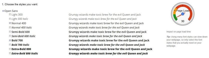
Among these, the Open and Droid fonts have the lowest page load. In fact, Open Sans has an impact of only 15 which probably is one of the lightest fonts in the Google Fonts family. Then comes Droid Sans which has an impact factor of just 25 which is great for any blog.
The font with the most heaviest impact is PT Sans which has a page load of 55. So, that’s considerably high load time impact for a font. Even if you want to use it, you may want to restrict it’s use and try to avoid using the bold face. The normal font faces ( font weight of 400 ) has lower load time impact than bold font faces ( font weight of 700 ; 800 in some cases ).
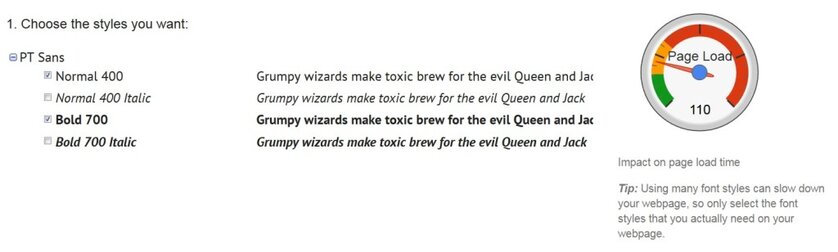
In fact, if you combine normal and bold face of Open Sans, you only have a load impact of 30 whereas in case of PT Sans, it’s 110 – which is a big difference.
Never Use Too Many Fonts
So, it should be pretty clear now that if you use too many Google fonts on your website, your loading time will suffer. So, make sure that you only use the fonts which are necessary. Also, if you have a Google font making a HTTP query but not using it, remove it from your theme because it will only slow down your site and you’re not even using it.
Even if you have to use multiple fonts, only use the light ones like Open Sans and Droid Sans, because they have a lower load time factor. In fact, my favorite is Open Sans. If you’re using WordPress, you should know that WordPress developers have chosen Open Sans for the Admin Dashboard area.
Avoid Importing Too Many Font Styles
Some of the fonts have many font styles ranging from light (font-weight of 300) to extra-bold (font-weight of 800). You should only import the styles the that you want to use. I prefer to use only the Normal and Bold Styles which is enough for most websites.
If you import multiple styles of a single font, then you again increase the load impact factor. For example, if you import all the styles of Open Sans, then the load impact factor goes upto a staggering 150 which is not good for your loading time.

So, make sure you keep these factors in mind while using Google fonts for your project or website.
