
These days, aspiring webmasters are blessed with many easy-to-use web building and publishing tools especially mobile friendly website builders. Though most of them are based on the intuitive drag-and-drop and What-You-See-Is-What-You-Get editing principles, they’re suitable for creating full-fledged websites of different complexity. Behind the incredibly user-friendly interface they hide powerful code converters and other sophisticated technologies that have made website building as easy, affordable and fast as ever.
In recent years, due to the importance of having a mobile-friendly version of a website, new options have emerged in this niche, namely WYSIWYG Mobile Editors. So, in this post I would like to focus on four site creators allowing even the novice to create responsive websites hands down.
IMCreator
IMCreator is a hosted CMS allowing newbies and pros to create sites from scratch bypassing the need to write codes (with this site maker you can either start with a blank canvas or using one of the default templates). IMCreator offers a wealth of high class themes grouped by industry: Services, Wedding, Hotel, Restaurant, Real Estate, Law, Model/Actor and others. Each website built with this site builder is web-standards compliant and has an inbuilt touch-friendly version.
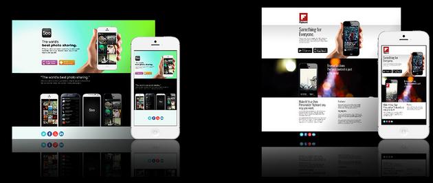
In case you’re looking to build a website that will be targeted exclusively at mobile users, you’re recommended to choose one of the unique Mobile Designs. These are all touch-friendly and can be edited in demo mode without registration. Each element of the design is 100% customizable, be it a logo, copy or image.
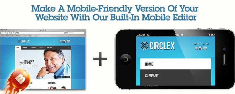
MotoCMS
MotoCMS website builder is also suitable for creating touch-friendly websites. Their Mobile Editor was introduced in 2012. Since then thousands of the MotoCMS users have optimized their existing and new websites for tablets and mobiles. The process is completely painless: everything is done via your inbuilt, point-and-click Mobile Editor. It is designed in the style of a mobile phone mockup, so that you will instantly see the way your optimized website will look like on a smaller screen without having to preview it somewhere else.
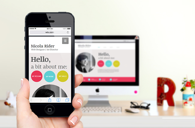
Wix
With Wix you can start either with a layout or one of the base templates, which are very impressive, to my mind. One of the nicest things about Wix is the overall ease of use. Whether you’re adjusting your design, uploading content or optimizing your pages for search engines, the process is absolutely hassle-free and seamless. The same applies to their inbuilt Mobile Editor. With its intuitive interface one can create a touch-friendly website in no time.

Webydo
Users of Webydo will benefit not only from their handy Mobile Editor, but also from the wealth of unmatched business-specific solutions. Just to name a few, there are:
1. Build My Brand option allowing designers to re-brand the system.
2. Share My Design for those who need to gather feedback from clients and/or colleagues.
3. Bill My Client to send payment requests and many other perks.
Summary
Website building can be fun and interesting if you use the right tools. All of the described web services have free versions, so you can try them out right after finishing this post. Happy site building!
Author Byline:
Howard Steele loves discovering and testing site building software and new gadgets. He writes and publishes top website builders reviews on SuperbWebsiteBuilders.com to help others find optimal solutions for their particular cases.